GrapeCity written test question
Title Source
Title URL: https://www.grapecity.com.cn/career/challenge
Title Description
Title: Data Visualization
Programming language: not limited
Title Description: There is a saying that goes like this: “A text is better than a table, and a table is better than a chart”. The image describes the very different efficiency and experience that charts bring to the receiver when conveying information. Therefore, at a time when computer computing power, data size and decision-making needs are increasing, the use of data visualization is becoming more and more common.
The scope of data visualization is wide and involves many concepts and areas such as data acquisition, processing, modeling, graphics, human-computer interaction, etc. To get started faster and have a better experience, it is wiser to use professional tools and services like DragonFly BI.
Today, we take a hands-on approach to simple data visualization with a simplified proposition. Write a program that, for a given set of data and requirements, outputs a bar graph composed of characters.
Input
- In the first row, an integer N (1<=n<=20), indicating the number of entries in this data set.
- The second line, two strings, is used to indicate how the data is sorted on the bar chart. The first string is “Name” or “Value”, which indicates that the sorting is based on the name or value of the data item; the second string is “ASC” or “DESC”, indicating ascending or descending order.
- The subsequent N lines, each containing a string S and a number V separated by spaces, represent a piece of data. s, the name of the data entry, contains only lowercase letters, and V, the corresponding value, is an integer, (0<=V<=1,000,000)
Output
Chart outer frame corner symbols:
- “┌”(\u250c)
- “┐”(\u2510)
- “└”(\u2514)
- “┘”(\u2518)
Horizontal and vertical lines in the chart:
Various cross lines in the chart:
- “├”(\u251c)
- “┤”(\u2524)
- “┬”(\u252c)
- “┴”(\u2534)
- “┼”(\u253c)
Characters used to spell columns:
Spaces in the chart:
The width of the name area in the chart is determined by the maximum length of the names in the set of data, all names are aligned to the right, the maximum length of the columns in the chart is 20, the length of each column is obtained by multiplying the ratio of the data corresponding to the column and the maximum value in the set of data (this value must be greater than 0) with 20, and rounding off the part that is less than one cell.
Input Example
1
2
3
4
5
|
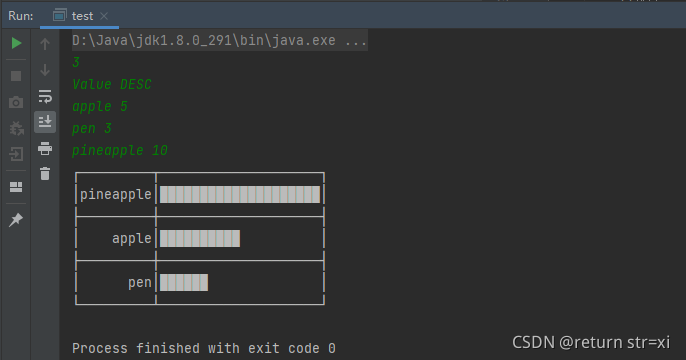
3
Value DESC
apple 5
pen 3
pineapple 10
|
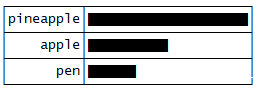
Output Example
Problem Solving
  1
  2
  3
  4
  5
  6
  7
  8
  9
 10
 11
 12
 13
 14
 15
 16
 17
 18
 19
 20
 21
 22
 23
 24
 25
 26
 27
 28
 29
 30
 31
 32
 33
 34
 35
 36
 37
 38
 39
 40
 41
 42
 43
 44
 45
 46
 47
 48
 49
 50
 51
 52
 53
 54
 55
 56
 57
 58
 59
 60
 61
 62
 63
 64
 65
 66
 67
 68
 69
 70
 71
 72
 73
 74
 75
 76
 77
 78
 79
 80
 81
 82
 83
 84
 85
 86
 87
 88
 89
 90
 91
 92
 93
 94
 95
 96
 97
 98
 99
100
101
102
103
104
105
106
107
|
import java.util.Arrays;
import java.util.HashMap;
import java.util.Scanner;

public class test {
    public static void main(String []args) {
    	Scanner sc = new Scanner(System.in);
    	int num = sc.nextInt();
    	String way = sc.next();
    	String seq = sc.next();

    	String name;
    	int value;
    	int maxLength = 0;
    	int maxNum = 0;

    	Object[] arr = new Object[num];
    	HashMap<Object, Object> map = new HashMap<>();

    	for (int i=0; i<num; i++) {
    		name = sc.next();
    		value = sc.nextInt();
    		if (name.length() > maxLength)
    			maxLength = name.length();
    		if (value > maxNum)
    			maxNum = value;
    		if (way.equals("Name")) {
    			map.put(name, value);
    			arr[i] = name;
    		} else {
    			map.put(value, name);
    			arr[i] = value;
    		}
    	}

    	//Sort
    	Arrays.sort(arr);
    	if (seq.equals("DESC")) {
    		int l = arr.length;
    		Object temp=0;
    		for (int i=0; i<l/2; i++) {
    			temp = arr[i];
    			arr[i] = arr[l-i-1];
    			arr[l-i-1] = temp;
    		}
    	}

    	//Output first line
    	System.out.print('\u250c');
    	for (int i=0; i<maxLength; i++)
    		System.out.print('\u2500');
    	System.out.print('\u252c');
    	for (int i=0; i<20; i++)
        	System.out.print('\u2500');
    	System.out.println('\u2510');

    	//Output the following lines, in groups of two
    	for (int k=0; k<num; k++) {
    		//Get the row data
    		if (way.equals("Name")) {
    			name = (String)arr[k];
    			value = (int)map.get(arr[k]);
    		} else {
    			value = (int)arr[k];
    			name = (String)map.get(arr[k]);
    		}
    		//Calculate column length
    		int q = (int)((double)value/maxNum*20);
    		//Contains data line output
    		System.out.print('\u2502');
    		for (int i=1; i<=maxLength-name.length(); i++) {
    			System.out.print('\u0020');
    		}
    		System.out.print(name);
    		System.out.print('\u2502');
    		for (int i=1; i<=q; i++) {
        		System.out.print('\u2588');
    		}
    		for (int i=q; i<20; i++) {
    			System.out.print('\u0020');
    		}
    		System.out.println('\u2502');
    		//Output border line
    		if (k == num-1) {
    			System.out.print('\u2514');
    			for (int i=0; i<maxLength; i++) {
    				System.out.print('\u2500');
    			}
    			System.out.print('\u2534');
    			for (int i=0; i<20; i++) {
    				System.out.print('\u2500');
    			}
    			System.out.println('\u2518');
    		} else {
    			System.out.print('\u251c');
    			for (int i=0; i<maxLength; i++) {
    				System.out.print('\u2500');
    			}
    			System.out.print('\u253c');
    			for (int i=0; i<20; i++) {
    				System.out.print('\u2500');
    			}
    			System.out.println('\u2524');
    		}
    	}
    }
}
|
Run Screenshot